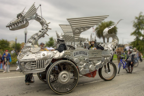
 With this photo, I com- pensated for overly bright sky and contrasty highlights on the "Tin Pan Dragon" sculpture by using a single photo which, as luck (not skill) would have it, had no blown out areas in order to make a high dynamic range (HDR) image that lost neither highlights nor shadow areas. To start, I made two copies of the original RAW file. The first was overexposed by about one stop to bring up detail in the shadows. The second copy was underexposed by the same amount to rescue detail in the highlights and sky. The original RAW file was well exposed. The three copies of the file were combined in Photomatix to make an HDR image.
After it was finished and saved, I blurred out the busy background to help the sculpture stand out from it. Rather than just apply Gaussian blur to the background and masking off the sculpture, I used a gradient mask on the background so that it came more into focus from the top of the image to the bottom. This kept it from looking completely unreal letting the closest bit of road seem in focus. Of course I completely maked out the dragon itself wanting it to all be in focus. Then I darkened the sky to bring up more detail in the clouds. The Gaussian blur is a bit much for realism, but I like the ethereal feel this took on when combining the blur with the HDR.

This is Peter Wagner who rode "Big Friendly Giraffe" in 2008. This photo originally had the same problems most of my photos had. The background was brighter than the foreground, stealing attention from the subject, Pete's face was in shadow because of his hat, and the depth of field was too great, keeping the background in focus enough to be distracting. But in the end I was very happy with this shot. I darkened the background and blurred it slightly plus I lightened the subject, especially from the cheeks to the hat brim.
Oh, I've forgotten to mention my new favorite thing in the world, Vibrance in Adobe Camera Raw. I have taken to using it instead of saturation in Photoshop because it keeps the colors truer much better than saturating them does. And it does it without having to mask off skin to prevent weird skin tones. It upped the blues in this photo very nicely with out making Pete look orange.
Then I spent a while fiddling with his eyes. I am no portrait photographer. I am more likely to complain that people are getting in my shot and ruining it, but I love seeing good portraits with beautiful eyes. So I played a bit to see what I could do. That's one of my favorite ways to learn Photoshop. I push the buttons. Slide the sliders all the way. See what happens. After masking for just these naturally great blue eyes, I ended up brightening them in a curves layer. This gave them a shiny, reflective look that I love in good portraiture. Then I created a second color balance layer and upped both the blue and the cyan. It was upping the cyan that pleased me most. I unwittingly overdid it and then sat with it for a while.
I am lucky enough to have two computers on my desk to work with. Its a great benefit of having a computer scientist for a husband! One computer I use for my job and surfing the internet, the other I often have a photo up in Photoshop. I'll work on my job for a while, then work on the photo. Sitting and looking at the photo now and then while I am doing my job helps me by letting the changes I made sort of percolate. After a while I can see where a layer I've used is overdone, or where that 'thing' in the background is bothering me although I hadn't noticed it when shooting (bad photographer! No biscuit!). Then I can go in and fix it. And I did just that with the cyan. Often just reducing the opacity of the offending layer does the trick, but in this case the one layer had enriched both the blue and the cyan and only the cyan needed to be changed. It was very easy to reopen the layer, and back off the cyan slider quite a bit until I had what you see here. Blue eyes to die for! And they match Pete's actual eye color much better than my dim, muddy RAW file originally showed.
At the request of a friend, here are copies of the files as they came out of my camera for comparison purposes. I've done nothing to these two except resize them and save them as jpgs.


I had no idea so much work went into constructing these photographs, they look great. If you kept copies, I'm curious about the before pictures.
ReplyDeleteAlso, I added you to my blogroll. We are teh frendz.
You got it!
ReplyDelete